Docs
This guide covers how to create and organize documentation pages in Trellis Docs. For blog posts and release notes, see Blog. For markdown syntax (code blocks, admonitions, tabs), see Markdown Features.
Creating a new page
Add an .mdx file under content/docs/. The file path determines its URL:
| File Path | URL |
|---|---|
content/docs/getting-started.mdx | /getting-started/ |
content/docs/guides/deployment.mdx | /guides/deployment/ |
content/docs/theme/index.mdx | /theme/ |
Use index.mdx for the landing page of a section (e.g. theme/index.mdx → /theme/).
Partial files
Files and folders that start with an underscore (_) are treated as partials — excluded from routing, search indexing, and the sidebar. This convention matches Docusaurus behavior, so content that worked in Docusaurus carries over.
content/
├── _includes/                    ✗ shared partials (available to docs, blog, and release notes)
│   └── common-warning.mdx
├── docs/
│   ├── guides/
│   │   ├── deployment.mdx        → /guides/deployment/
│   │   └── _internal-notes.mdx   ✗ no route, not indexed
│   ├── _includes/                ✗ docs-only partials
│   │   └── setup-steps.mdx
│   └── getting-started.mdx       → /getting-started/
├── blog/
└── release-notes/
Use partials for:
- Reusable snippets you include in other pages with
@include - Internal reference notes that shouldn't be published
- Draft content that isn't ready for readers yet
To hide a file, prefix its name with _:
# Hide a page
mv content/docs/guides/draft.mdx content/docs/guides/_draft.mdx

# Hide an entire folder
mv content/docs/internal content/docs/_internal
The excludedPrefixes option also excludes partial files from the Smart Search index.
Including partials
Use the @include directive to inline a partial's content into another page. The directive must be on its own line.
Relative paths
Paths starting with ./ or ../ resolve relative to the file containing the directive:
@include ./_install-steps.mdxRoot-relative paths
Paths starting with / resolve from the content/ directory. This lets you share partials across docs, blog posts, and release notes:
@include /_includes/common-warning.mdx
@include /docs/_includes/setup-steps.mdx
Trellis Docs automatically strips frontmatter from the partial and inlines only the body content.
Example
Create a shared partial:
---
title: Support Note (partial)
---

:::note
Need help? Open an issue on [GitHub](https://github.com/your-org/your-repo/issues).
:::
Include it in a doc page, a blog post, and a release note:
## Getting Started

@include /_includes/support-note.mdxWelcome to our documentation!
@include /_includes/support-note.mdx## Added
- Initial release
@include /_includes/support-note.mdxThe admonition renders inline as if it were written directly in each file.
Where to put partials
| Location | Use case |
|---|---|
content/_includes/ | Shared across docs, blog, and release notes |
content/docs/_includes/ | Docs-only partials |
Any _-prefixed file or folder | Colocated partials next to the pages that use them |
What works inside partials
Included content goes through the full MDX (Markdown with JSX) pipeline, so everything works:
- Admonitions (
:::tip,:::warning, etc.) - Variables (
{vars.productName}) - Tabs, code blocks, tables, and all other markdown features
- Components (
<Callout>,<Tabs>, etc.)
Nested includes
Partials can include other partials, up to 5 levels deep:
@include ./_node-version.mdx
@include ./_editor-setup.mdx
Migrating from Docusaurus
If you're migrating from Docusaurus, the migration script automatically converts the Docusaurus import pattern:
import SetupSteps from './_setup-steps.mdx';

<SetupSteps />
Into the Trellis @include directive:
@include ./_setup-steps.mdxFrontmatter
Every page starts with YAML frontmatter:
---
title: My Page Title
description: A short description for search results and SEO.
keywords: [keyword-one, keyword-two]
last_update:
  date: 02/22/2026
  author: Your Name
hide_title: false
hide_table_of_contents: false
doc_type: how-to
role: [Developer, Admin]
draft: false
---| Field | Required | Description |
|---|---|---|
title | Yes | Page title, displayed as the h1 heading |
description | No | Used in search results and meta tags |
keywords | No | Array of keywords to boost search relevance |
last_update.date | No | Displayed at the top of the page (MM/DD/YYYY) |
last_update.author | No | Subject matter expert for the page (visible when lastUpdated.showAuthor is true in config/site.ts) |
hide_title | No | Set to true to hide the h1 heading, last-updated date, and "Edit this page" link. The title is still used for the browser tab and breadcrumbs |
hide_table_of_contents | No | Set to true to hide the right-side table of contents (TOC) |
doc_type | No | Content type for auditing (e.g. how-to, concept, reference, tutorial). Not rendered on the page — used in sidebar exports |
role | No | Array of audience roles (e.g. [Developer, Admin]). Rendered as colored chips below the page title |
draft | No | Set to true to exclude the page from the production build, search index, and FAQ index |
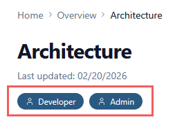
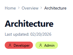
Role chips
When you add a role array to a page's frontmatter, Trellis renders each role as a colored chip below the title. This helps readers quickly identify whether a page is relevant to them.
Roles are purely informational — they don't restrict access. Use any labels that make sense for your audience (e.g. Developer, Admin, Designer, Product Manager). The default color scheme assigns a unique color to each role. Customize colors in config/site.ts with the roleColors field:
---
title: Architecture
keywords: [architecture, design tokens, theme, plugins, build]
role: [Developer, Admin]
last_update:
  date: 02/20/2026
---
You can customize role colors in config/site.ts.
Document type
The doc_type field is metadata-only — it is not rendered on the page. Use it to classify pages for content auditing:
doc_type | When to use |
|---|---|
concept | Explains what something is or why it matters |
how-to | Step-by-step instructions for a specific task |
reference | API docs, config options, parameter tables |
tutorial | End-to-end guided walkthrough |
The sidebar export includes both doc_type and role for spreadsheet-based auditing.
Draft pages
Set draft: true in a page's frontmatter to exclude it from the production build:
---
title: Upcoming API Changes
draft: true
---
Draft pages are:
- Excluded from the build — no static page is generated, so the URL returns a 404 in production
- Excluded from search — not indexed by the Smart Search plugin
- Excluded from FAQ index — not indexed by the FAQ Index plugin
- Visible in sidebar exports — the sidebar export includes a Draft column so you can track which pages are still in progress
Use draft: true for pages that are actively being written. Unlike the _ prefix convention (which hides files from the filesystem level), drafts stay in the sidebar config and appear in content audits — making them easier to track.
Configuring the sidebar
The sidebar is defined in config/sidebar.ts. If you've used Docusaurus, this plays the same role as sidebars.js — but it's a typed TypeScript array instead of a plain object.
Item types
The sidebar supports two item types: doc (a link to a page) and category (a collapsible group).
export const mainSidebar: SidebarItem[] = [
  // A standalone doc at the top level
  { type: 'doc', id: 'getting-started' },

  // A category with child docs
  {
    type: 'category',
    label: 'Guides',
    items: [
      { type: 'doc', id: 'guides/content-authoring' },
      { type: 'doc', id: 'guides/deployment' },
    ],
  },
]
Doc items
A doc item links to a page. The id is the file path under content/docs/ without the extension:
| File | id |
|---|---|
content/docs/getting-started.mdx | 'getting-started' |
content/docs/guides/deployment.mdx | 'guides/deployment' |
content/docs/theme/index.mdx | 'theme/index' |
Trellis derives the sidebar label from the filename by default. Override it with the label property:
{ type: 'doc', id: 'overview/index', label: 'What is Trellis?' }Categories
A category is a collapsible group with a label and child items:
{
  type: 'category',
  label: 'Guides',
  collapsed: true,
  items: [
    { type: 'doc', id: 'guides/content-authoring' },
    { type: 'doc', id: 'guides/writing-docs' },
  ],
}| Property | Required | Description |
|---|---|---|
label | Yes | Display text in the sidebar |
items | Yes | Array of child doc or category items |
collapsed | No | Start collapsed (true) or expanded (false, default) |
link | No | Doc id to make the category label itself a selectable link |
Linking a category to a page
By default, selecting a category label toggles it open or closed. Use the link property to make the label navigate to a page — the chevron still toggles expand/collapse independently:
{
  type: 'category',
  label: 'Theme',
  link: 'theme/index',    // selecting "Theme" navigates to /theme/
  collapsed: true,
  items: [
    { type: 'doc', id: 'theme/last-updated' },
    { type: 'doc', id: 'theme/tabs' },
  ],
}
This avoids the need for a redundant child like "Theme Overview" under a "Theme" category. Categories without link (like "Guides") remain plain collapsible headers.
Nesting categories
Categories can be nested for deeper hierarchies:
{
  type: 'category',
  label: 'API',
  items: [
    {
      type: 'category',
      label: 'REST',
      items: [
        { type: 'doc', id: 'api/rest/authentication' },
        { type: 'doc', id: 'api/rest/endpoints' },
      ],
    },
    { type: 'doc', id: 'api/graphql' },
  ],
}
Sidebar export
The sidebar export generates a CSV snapshot of your documentation structure, including frontmatter metadata from every page. It's designed for content auditing in a spreadsheet.
node scripts/export-sidebar.js > sidebar.csvOr via npm:
npm run export:sidebar > sidebar.csvThe CSV includes one row per page in sidebar order, with the following columns:
| Column | Source |
|---|---|
| Doc ID | config/sidebar.ts item id |
| Title | title frontmatter or sidebar label |
| URL | Derived from doc id |
| Category | Parent category path (e.g. Guides > Deployment) |
| Draft | draft: true frontmatter → Yes |
| Doc Type | doc_type frontmatter |
| Role | role frontmatter (semicolon-separated) |
| Last Updated | last_update.date frontmatter |
| Author | last_update.author frontmatter |
| Description | description frontmatter |
| Keywords | keywords frontmatter (semicolon-separated) |
| File Path | Relative path from project root |
The export reflects the sidebar order, not alphabetical order, so the CSV rows match the reading sequence a user would follow through the docs.
Landing page
By default, the root URL (/) renders a landing page with a hero section and feature cards. This is defined in app/page.tsx.
Skipping the landing page
Most documentation sites don't need a marketing-style landing page — visitors should go straight to the docs. To bypass the landing page and redirect / to your first doc, replace the contents of app/page.tsx:
import { redirect } from 'next/navigation'

export default function Home() {
  redirect('/getting-started/')
}
Change '/getting-started/' to whichever page you want as your entry point. The redirect works with static export — Next.js generates an HTML page with a <meta http-equiv="refresh"> tag, so no server is required.
After switching to a redirect, you can also remove imports and assets that were only used by the landing page, such as the hero logo in config/site.ts (logo.hero) and any feature card data.
Customizing the landing page
To keep the landing page but tailor it, edit app/page.tsx directly. It's a regular React component — not MDX — so you have full control over layout. The key pieces to update are:
- Hero text — the tagline and call-to-action buttons
- Feature cards — the
featuresarray at the top of the file - Hero logo — the logo image, configured via
logo.heroandlogo.useBuiltIninconfig/site.ts
Images
Place images in public/img/ and reference them with an absolute path:
All images automatically support click-to-zoom via the built-in lightbox — no extra markup needed. Click any image to open it in a full-screen modal overlay.
Disabling zoom on specific images
To prevent an image from being zoomable, add nozoom in the title position:
The image renders normally but without the zoom cursor or lightbox behavior.
You can combine nozoom with a width value:
Image sizing
Unlike Docusaurus, Trellis Docs lets you control image width directly in markdown — no HTML or custom components needed. By default, images render at 60% of the content width. To override the size, add a width value in the title position of the markdown image syntax:


Supported formats:
| Syntax | Example | Result |
|---|---|---|
| Percentage | "50%" | 50% of the content width |
| Pixels | "400px" | Fixed 400px width |
width= prefix | "width=75%" | Same as "75%" — explicit prefix is optional |
nozoom | "nozoom" | Disables the lightbox for this image |
| Combined | "nozoom 50%" | No zoom + custom width |
When a custom width is set, it replaces the default 60% max-width. Directives like nozoom and width values are parsed from the title and do not appear as tooltips. Any remaining text in the title is preserved as the tooltip.
Variables
Trellis Docs supports reusable variables in MDX files — a feature Docusaurus doesn't offer.
Hiding the page title
Set hide_title: true in frontmatter to remove the rendered h1 heading, last-updated date, and "Edit this page" link from the page. The title is still used for the browser tab (<title>), breadcrumbs, sidebar labels, and search indexing.
---
title: My Custom Page
hide_title: true
---
This is useful for pages where you want full control over the layout — for example, a landing-style page within the docs section, or a page that uses a custom heading component.
In Docusaurus, this field is also called hide_title. Content migrated from Docusaurus works without changes.
VS Code snippets
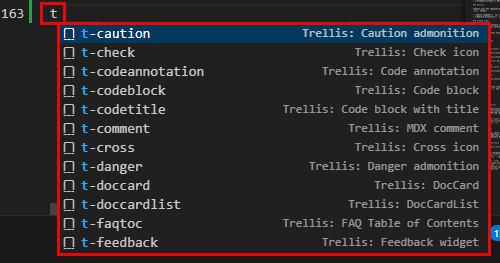
Trellis Docs ships a set of workspace snippets in .vscode/trellis.code-snippets that cover every Trellis-specific MDX feature. All snippets are prefixed with t- so they're easy to find — type t in any .mdx file and VS Code's autocomplete will show the full palette.
Frontmatter scaffolds
| Snippet | What it inserts |
|---|---|
t-front-doc | Full doc page frontmatter with title, description, keywords, date, doc_type, role, and draft fields |
t-front-blog | Blog post frontmatter with authors and category |
t-front-release | Release note frontmatter with version and changelog sections |
Date fields auto-populate with today's date. Boolean and enum fields (like doc_type and draft) present a dropdown so you can pick a value without typing.
Admonitions
| Snippet | Output |
|---|---|
t-note | :::note ... ::: |
t-tip | :::tip ... ::: |
t-info | :::info ... ::: |
t-caution | :::caution ... ::: |
t-danger | :::danger ... ::: |
t-warning | :::warning ... ::: |
Each snippet includes an optional custom title — tab past it to skip, or type to set one.
Components
| Snippet | Output |
|---|---|
t-tabs | Full <Tabs> container with two <TabItem> children |
t-tab | Single <TabItem> to add inside an existing <Tabs> block |
t-tooltip | <Tooltip content="...">Term</Tooltip> |
t-doccard | <DocCard> with title, href, and description |
t-doccardlist | <DocCardList /> |
t-check | <Check /> green checkmark |
t-cross | <Cross /> red cross |
t-partial | <Partial /> yellow partial icon |
t-feedback | <Feedback /> page rating widget |
t-flip | <FlippingCard> with front/back content |
t-glossary | <Glossary /> |
t-faqtoc | <FaqTableOfContents /> |
t-chip | <Chip color="green">Label</Chip> colored badge (green, red, yellow, blue, neutral) |
Content features
| Snippet | Output |
|---|---|
t-include | @include directive with path picker |
t-codeblock | Fenced code block with language selector |
t-codetitle | Code block with title="filename" bar |
t-codeannotation | Inline // [!code highlight], ++, --, or focus comment |
t-var | Content variable {vars.productName} |
t-comment | MDX comment {/* ... */} |
t-truncate | Blog excerpt fold marker {/* truncate */} |
t-mermaid | Mermaid diagram block with type selector |
t-img | Image with width= attribute |
Standard markdown
| Snippet | Output |
|---|---|
t-table | Markdown table scaffold with header row |
t-tasklist | Checkbox task list |
t-link | Markdown link [text](url) |
Recommended extension
The workspace also includes .vscode/extensions.json, which prompts VS Code to install the MDX extension for syntax highlighting. Without it, .mdx files fall back to plain markdown mode and component snippets (like t-tabs) won't appear in autocomplete.